CLIENT: Izza Pops
Plant-based frozen treats made with simple ingredients.
Logo design | Illustration | Package design | Typography
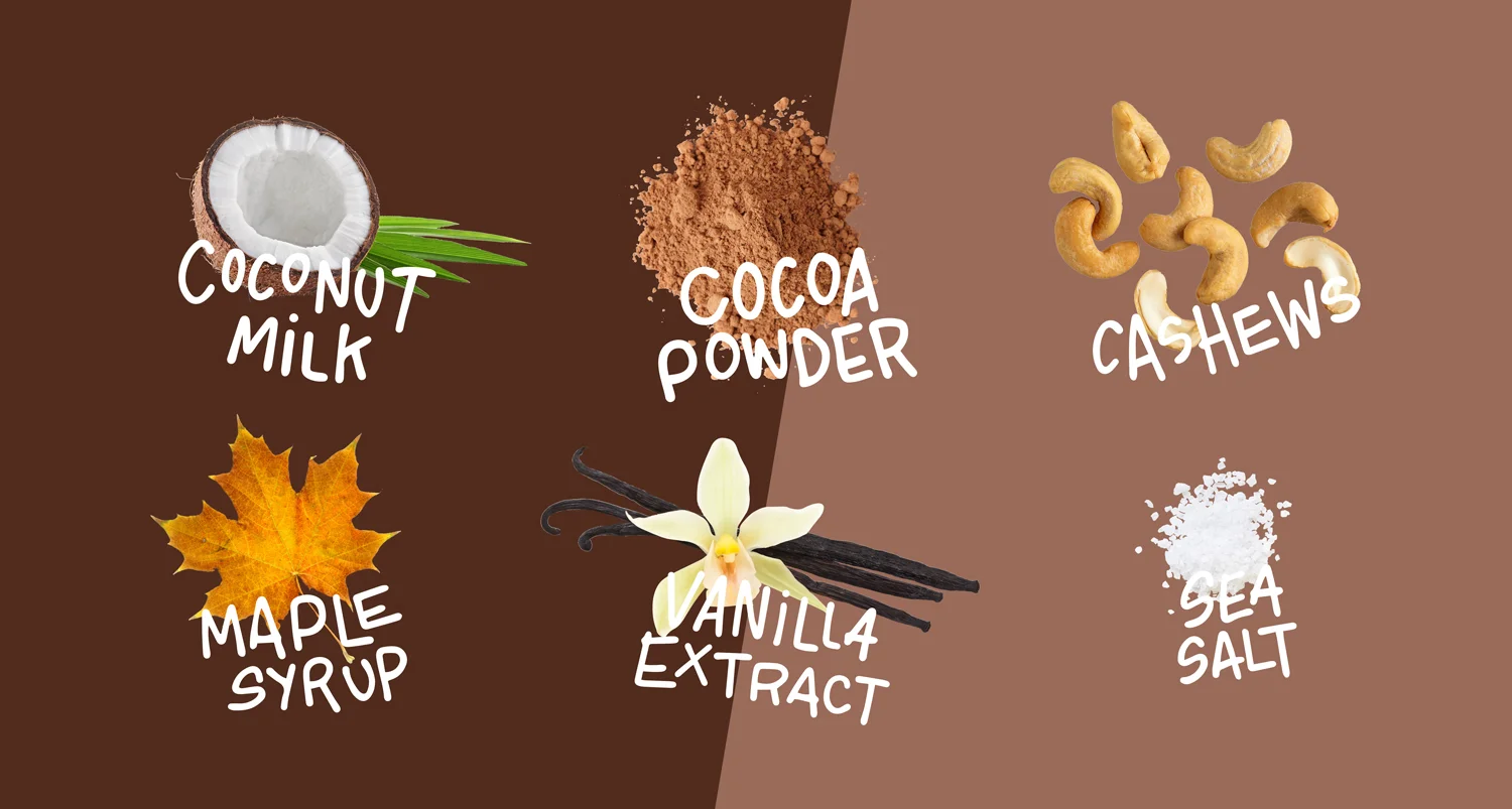
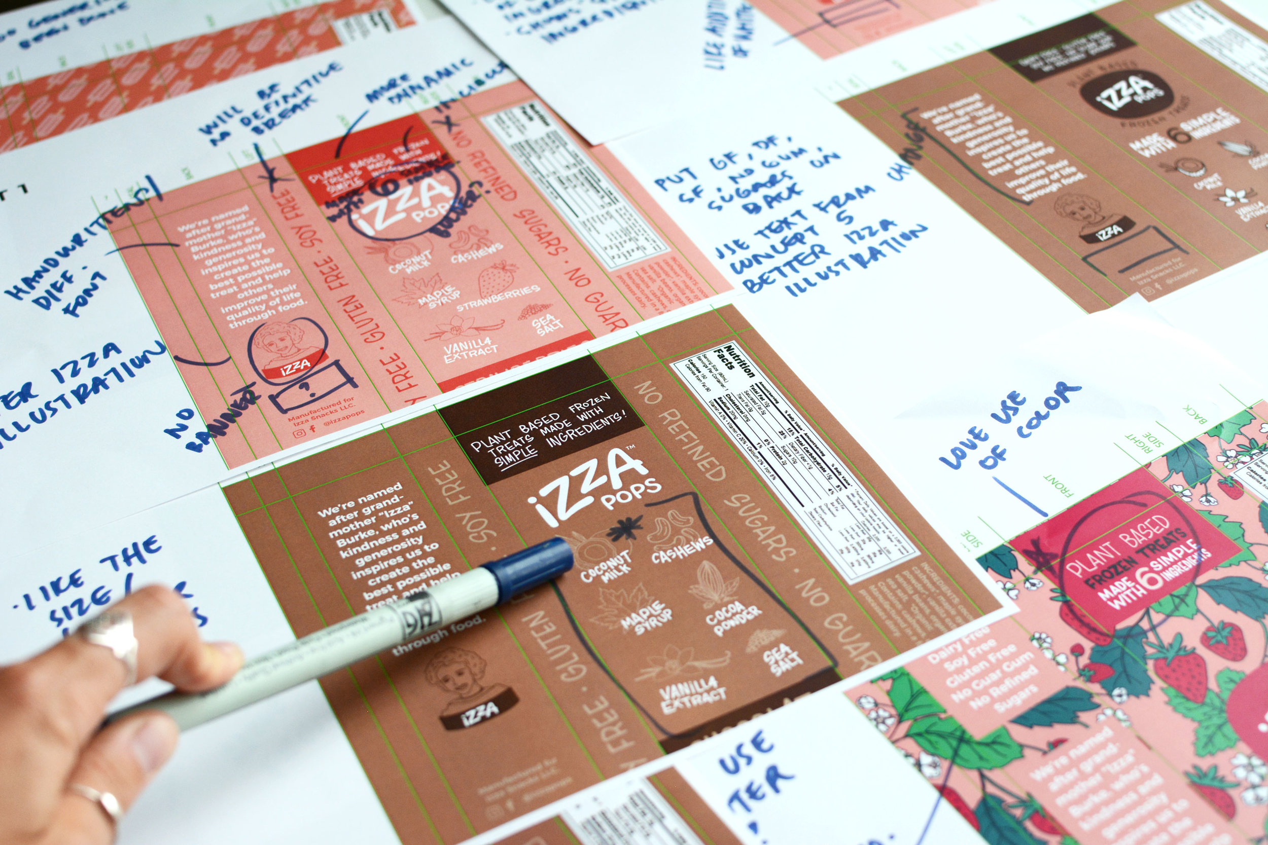
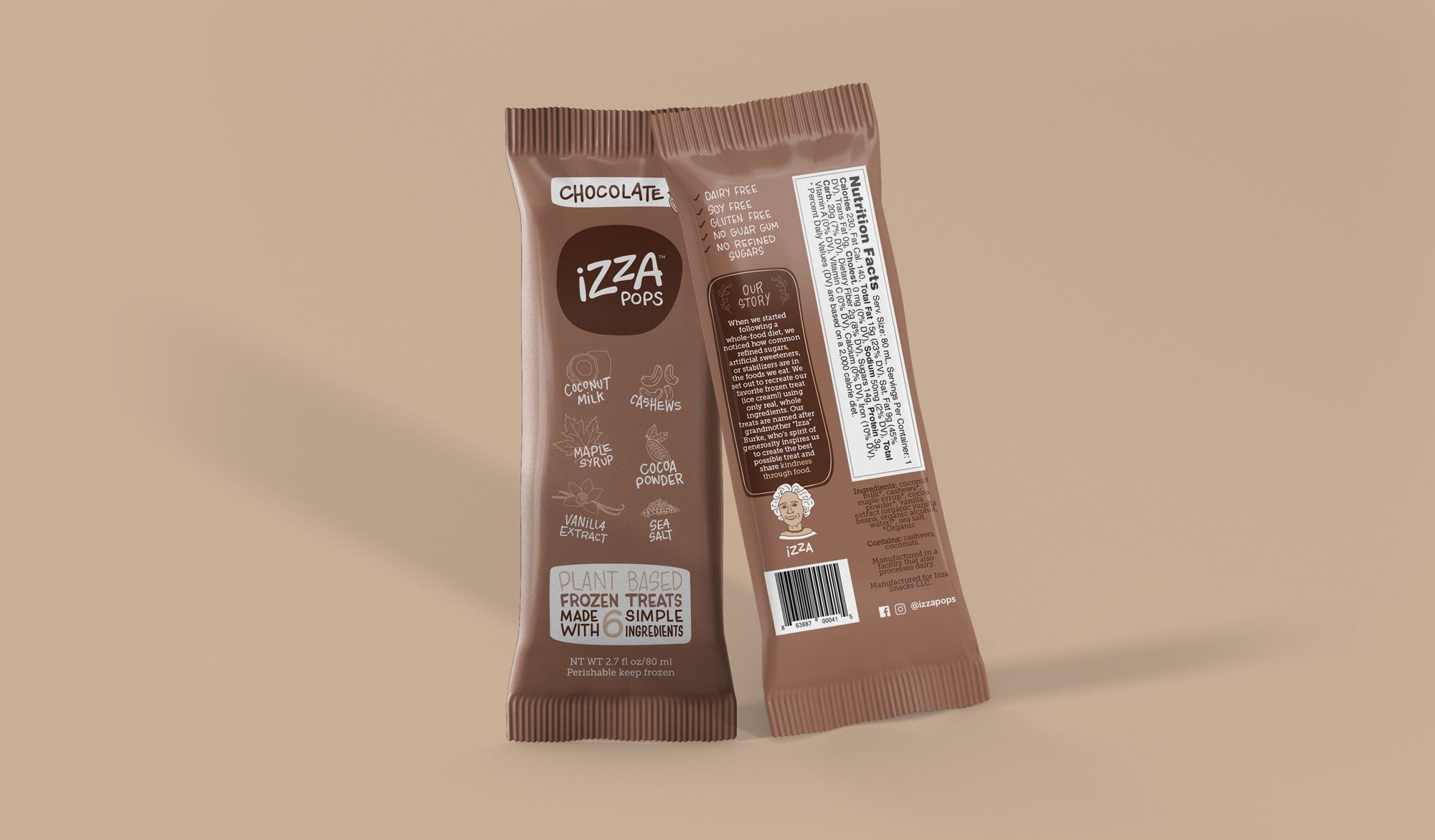
Izza Pops came to us needing a refresh for their brand. The product came from the owner's struggles to find snacks that were free of undesirable ingredients but tasted good. They found that many options labeled as “healthy” were actually full of ingredients you couldn’t pronounce and contained tons of processed sugars. Their aim was to stand out as the only “clean eating” option in the frozen space. Each pop has 6 ingredients or less and are all organic, clean, and minimally processed. For their package, they wanted something playful and authentic, yet simple and clean to showcase their simple ingredients.
BEFORE
AFTER


